


Your handwriting is completely unique. No two people in the world write exactly the same way, and that individuality is precisely what makes turning your handwriting into a digital font such a powerful creative move. Whether you want to personalize your business brand, create custom greeting cards, publish a book with a distinctive typeface, or simply preserve your penmanship for future generations, learning how to make your handwriting a font is one of the most rewarding digital projects you can take on.
In the past, creating a custom font required specialized software, expensive design knowledge, and hours of painstaking technical work. Today, a handful of free and affordable tools have democratized the process entirely. Anyone with a pen, a piece of paper, and a smartphone or scanner can transform their handwriting into a fully functional, installable font file within an afternoon.
This guide walks you through every single step of the process — from understanding what a font actually is and why your handwriting translates so beautifully into one, to choosing the right tools, preparing your letters correctly, and installing your finished font across all your devices. Along the way, you will pick up professional tips that help your font look polished, consistent, and genuinely usable in real projects.
The process is far simpler than most people assume. You do not need to know anything about graphic design, typography, or programming. What you do need is a little patience, a steady hand, and the enthusiasm to see your personal script take on a digital life. By the end of this guide, you will have a working font file ready to use in Word documents, Canva, Photoshop, Illustrator, and any other application that supports custom fonts.
So pick up your favorite pen, grab a clean sheet of paper, and get ready to discover exactly how to make your handwriting a font that truly belongs to you.
What Is a Font and How Does Handwriting Become One?
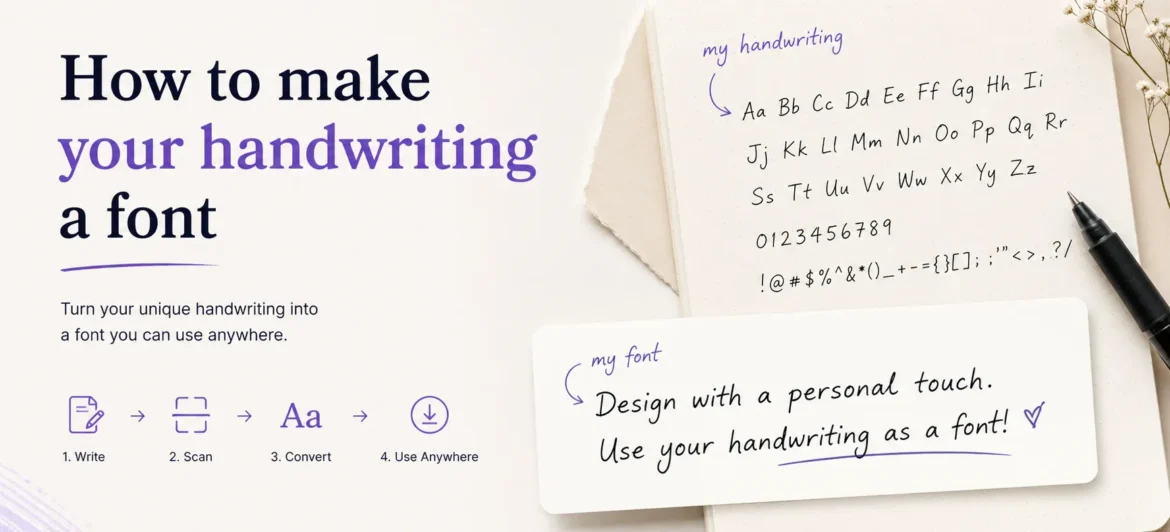
Before diving into the practical steps of how to make your handwriting a font, it helps to understand what a font file actually is. A font is a digital file — typically in .TTF (TrueType Font) or .OTF (OpenType Font) format — that maps specific visual shapes to the keys on your keyboard. When you press the letter “A,” your computer looks up the shape assigned to that character in the font file and renders it on screen.
Handwriting becomes a font through a process called vectorization. When you write letters on paper, your strokes are captured as a raster image — essentially a grid of pixels, like a photograph. A font creation tool then traces the outline of each letter, converting those pixels into smooth mathematical curves called vectors. Vectors scale infinitely without losing quality, which is why a font looks crisp whether you print it at 12 points or blow it up to a poster-sized 300 points.
The quality of your final font depends heavily on the quality of your original handwriting sample. Clean, consistent letterforms with predictable stroke widths tend to vectorize beautifully. Scratchy, uneven, or overly rushed writing often creates jagged outlines that require extensive manual correction. This is why taking a few extra minutes to write your template slowly and deliberately pays enormous dividends in the final result.
Modern font creation platforms handle most of the technical complexity for you. They accept scanned images, automatically detect letter boundaries, and generate proper font metrics like baseline, cap height, x-height, and ascender lines. You do not need to understand all of these terms — the tools build them into their templates. Your job is simply to fill each box with a clear, well-formed version of the letter it represents.
Understanding this basic workflow — write on paper, scan, upload, download font file, install — removes the mystery from the process and lets you focus on what truly matters: writing your letters well the first time.
Best Tools to Make Your Handwriting a Font
Free Online Tools Worth Bookmarking
The following platforms make it possible to create a handwriting font without spending a single dollar. Each has a distinct workflow and feature set, so choose the one that best matches your comfort level and goals.
- Calligraphr — The most popular free option. Offers a downloadable template, automatic vectorization, and free account creation with up to 75 characters per font. Ideal for most personal projects.
- Fonty (Android App) — Lets you draw letters directly on your smartphone screen using your finger or a stylus. Great for quick projects when you do not have access to a scanner.
- FontStruct — A grid-based font builder that works entirely in the browser. Better suited to geometric or blocky styles than flowing handwriting.
- MyScriptFont — An older but still functional tool where you download a template, fill it in, scan it, and upload the image to receive a downloadable font file immediately.
- PicFont — Simple and beginner-friendly, PicFont walks you through photographing individual letters and assembling them into a font step by step.
Paid and Professional Tools for Higher Quality
- Glyphs (Mac) — Industry-standard software for professional font designers. Overkill for casual users but exceptional for anyone who wants full control over kerning, spacing, and OpenType features.
- FontLab — Available on both Mac and Windows, FontLab offers powerful import and editing tools that allow you to refine every aspect of your vectorized handwriting.
- Adobe Illustrator — Not a dedicated font tool, but its Live Trace feature can vectorize scanned handwriting, which can then be exported into a proper font editor like Glyphs.
- Calligraphr Premium — The paid tier removes the 75-character limit, allowing you to create full character sets with international characters, ligatures, and stylistic variants.
How to Make Your Handwriting a Font: Step-by-Step Process
Step 1 — Download or Print the Template
Visit Calligraphr.com, create a free account, and navigate to the Templates section. Download the standard template, which displays a grid of empty boxes — one for each letter of the alphabet, numbers zero through nine, and common punctuation marks. Print this template on plain white paper at 100% scale (do not resize it). The template boxes are precisely sized to help the software locate each character during upload.
Step 2 — Write Your Letters Carefully
- Use a dark, fine-tipped pen — a 0.5mm ballpoint or fineliner works best. Avoid pencils, which scan poorly, and thick markers, which lose fine detail.
- Write each letter inside its designated box without letting any stroke touch or cross the box border.
- Write at a natural, comfortable size — not unusually large or cramped.
- Stay consistent: if your lowercase “a” has a certain loop, replicate that same loop every time the letter appears.
- Fill in all character boxes you want included in your font. At minimum, complete all 52 upper and lowercase letters plus ten digits.
- Leave the box completely blank if you do not want to include a character — the tool will skip it.
Step 3 — Scan or Photograph Your Template
A flatbed scanner produces the best results. Scan at 300 DPI in grayscale or black-and-white mode. If you do not have a scanner, use a scanning app on your smartphone such as Adobe Scan, Microsoft Lens, or CamScanner. Hold your phone directly above the template, ensure even lighting with no shadows across the page, and capture the image as a high-resolution JPEG or PNG.
Step 4 — Upload and Process
Log back into Calligraphr and upload your scanned image using the Upload Template button. The platform automatically detects each character box and crops out the individual letters. Review the previews carefully — if any letter looks distorted, too light, or incorrectly cropped, you can delete it and redraw just that character. Once satisfied, click Create Font to trigger the vectorization process.
Step 5 — Adjust Spacing and Baseline
After vectorization, Calligraphr displays your font in a preview window. Look for common issues: letters that sit too high or too low on the baseline, characters that appear too close together (tight kerning) or too far apart, and any letters whose outlines look rough or broken. Use the platform’s adjustment tools to correct baseline position and character spacing. This step significantly impacts how natural your font looks in actual text.
Step 6 — Download and Install Your Font
Click Download Font to receive a .TTF or .OTF file. On Windows, right-click the file and select Install for All Users. On Mac, double-click the file and click Install Font in the Font Book preview. On iOS, use a font manager app like AnyFont. On Android, apps like iFont make installation straightforward. Once installed, your handwriting font appears in the font menu of every application on that device.
Tips for Making Your Handwriting Font Look Natural and Professional
The difference between a handwriting font that looks authentic and one that looks robotic almost always comes down to consistency and character variation. Real handwriting is never perfectly uniform — but it is also never wildly chaotic. Aim for the sweet spot: deliberate consistency with subtle, natural variation.
Write Multiple Versions of Each Letter
Calligraphr Premium and some other tools support alternate glyphs — multiple versions of the same letter that the software randomly cycles through. This prevents the “stamp effect,” where repeated letters look suspiciously identical. Even if your tool does not support alternates, writing your template letters slightly differently from one another (as you naturally would in flowing handwriting) adds authenticity.
Pay Attention to These Common Mistakes
✦ Never let ink strokes touch the template box borders — this causes vectorization errors that are tedious to fix manually.
✦ Always write with the pen perpendicular to the paper — tilting the pen changes stroke width inconsistently.
✦ Do not rush. The five minutes you save rushing the template will cost you thirty minutes of cleanup later.
Fine-Tune Kerning for Common Letter Pairs
Kerning refers to the spacing between specific pairs of letters. The pairs “AV,” “WA,” “To,” “Ty,” and “LT” are notorious for looking awkward if their spacing is not manually adjusted. Most font tools include a kerning editor that lets you set custom spacing for any two-character combination. Spend time reviewing your font in a few sample sentences and correct any pairs that look unusually cramped or wide.
Test Your Font Before Distributing It
Install your font and type a paragraph of real text in a word processor. Look for missing characters (which appear as empty boxes or question marks), letters that collide with each other, and any glyphs that look out of place in context. The pangram “The quick brown fox jumps over the lazy dog” contains every letter of the alphabet and is the standard test sentence used by typographers worldwide. Use it first.
Creative Ways to Use Your Custom Handwriting Font
Once you have created your handwriting font, the creative possibilities are genuinely limitless. Here are some of the most popular and impactful ways people use their personal typeface across both digital and print media.
Personal Branding and Business
- Use your handwriting font in your logo to add authenticity and a human touch to your brand identity.
- Create personalized email signatures that stand out in a crowded inbox.
- Design business cards and letterheads with your own script for a genuinely unique impression.
- Add handwritten-style call-to-action text to social media graphics and promotional images.
Creative and Personal Projects
- Greeting cards and invitations — Wedding invitations, birthday cards, and holiday greetings feel infinitely more personal when written in your own handwriting font.
- Children’s books and journals — Parents and authors use their handwriting fonts to self-publish books with a warm, personal aesthetic.
- Memory preservation — Preserving a grandparent’s or loved one’s handwriting as a font before it is lost forever is one of the most meaningful applications of this technology.
- Digital journaling — Type-written entries in your own handwriting script maintain the intimacy of journaling without the wrist fatigue.
- Educational materials — Teachers create worksheets in their own handwriting to give students a more approachable, personal learning experience.
Troubleshooting Common Problems When Making Your Handwriting Font
Problem: Letters Look Fuzzy or Have Rough Edges
Cause: Low scan resolution or light ink. Fix: Re-scan at 300 DPI minimum, or use a darker pen. In the font editor, use the smooth curve tool to clean up rough vector outlines manually.
Problem: Letters Sit at Different Heights
Cause: Inconsistent baseline placement during writing. Fix: Use the baseline adjustment slider in your font tool to align each letter to a consistent vertical position. Draw a light pencil baseline on your template before writing in pen next time.
Problem: Some Characters Are Missing in Word/Photoshop
Cause: Those characters were not included in your font file. Fix: Return to the font tool, add the missing characters, re-download the font file, uninstall the old version, and install the updated one.
Problem: Font Looks Too Robotic — Letters Look Stamped
Cause: Perfectly identical letterforms remove the natural variation of real handwriting. Fix: Upgrade to Calligraphr Premium and create alternate glyphs, or deliberately introduce slight size and angle variation when redrawing your template.
Conclusion
Learning how to make your handwriting a font is one of those rare creative projects that is both technically accessible and deeply personal. You start with nothing more than pen and paper, and you end with a fully functional digital typeface that carries the unmistakable imprint of your hand.
The process, when broken down into its core steps — print template, write carefully, scan cleanly, upload, adjust, and download — is achievable by anyone with a couple of hours and a willingness to be patient with the details. Free tools like Calligraphr have eliminated every technical barrier that once made custom font creation the exclusive territory of professional designers.
Whether you are creating a font for business branding, personal projects, sentimental preservation, or pure creative experimentation, the result is something uniquely yours. No AI, no stock font library, and no commercial typeface can replicate the specific curves, angles, and personality that your handwriting carries.
Take your time with the template, test your font thoroughly before publishing it, and do not be discouraged if the first version needs refinement — even professional typefaces go through dozens of revisions. The important thing is to start. Your handwriting deserves to live beyond the page.